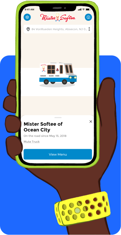
Are you launching a mobile app for your business? The look and feel of an app are incredibly important for user engagement, so it’s essential that your design delivers a quality product that showcases your brand. To put things simply, you want to create an app that looks good.
In this blog post, we will go over different design techniques used to make sure that your mobile application has the best possible presence in the digital space. We’ll cover topics such as:
- Choosing the right color palette
- Creating visuals that appeal to users
- Designing for multiple platforms with consistency in mind
- Creating visually pleasing layouts
By following these tips, you can be confident that your app’s design makes an impact and helps set it apart from competitors!
How to Choose the Right Color Palette
Choosing the right color palette for your app is essential to create an app that looks good and is easily navigable. An effective color palette needs to strike a balance between good aesthetics and usability.
Achieving this balance means considering factors such as colors’ tonality, their relationship with each other (e.g., contrasting ones), and any matching of colors with content (such as emotions).
For help in getting the right colors, consider downloading one of the many user-friendly apps/software programs which can create custom palettes, or search out pre-defined color palettes featured in respected sites like Adobe Color Wheel.
However you choose your COLORS – be strategic! Do not underestimate the power of visual design in bringing success to your mobile application.
Focus on Visuals that Appeal to your Unique Users
Creating visuals that appeal to users is essential for any successful product. Without thoughtful and accessible design, it will be difficult for users to engage with the app.
To create an app that looks good, consider elements like color schemes and typography. The combination of beautiful design and easy navigation should create a consistent look and feel across all devices.
Additionally, focusing on functionality ensures simple user interactions that can help create a strong visual experience. By crafting visually appealing designs and utilizing unique styles, your app can stand out from the competition and create an enjoyable user experience.
You might be wondering, how do I find out what my users like and dislike? How do I make something that appeals to them?
Think about who your users are and what their aesthetic tastes are. What do they like? Answering this question off the cuff can be very difficult. After all, creating an app is an investment. You don’t want to pour those resources into a project based on a guess or two.
This is where preliminary market research comes in. Before you build anything, this research is critical. It should inform all of your app’s visual elements.
Design for Multiple Platforms
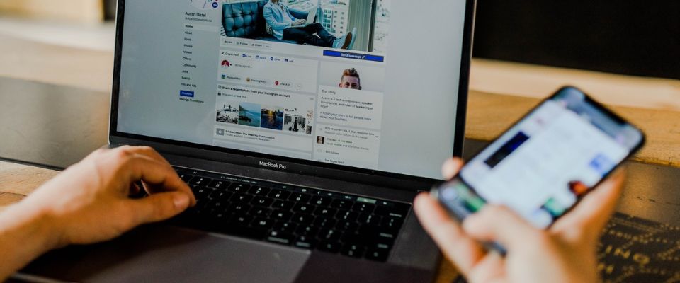
Developing an app that looks great across multiple platforms can be challenging, but with the right design strategies, you can create a consistent experience for all your users.
It involves designing with a range of screen sizes, resolutions and aspect ratios in mind. This means it is important to consider the full scope of the project before starting. A key part of this process is being able to create interfaces that both look great and function perfectly on all the platforms you’re targeting.
It is also critical to know who you want to reach and why.
For example, do you want to create an iOS app because those users typically spend more money. Do you want to create an Android app to have a global reach? Do you want to leverage the benefits of both?
What age is your ideal user? In what kinds of places do they live? What are their needs? Are they more likely to access your app on a mobile phone or an iPad?
This is why it is often it is best to keep many types of devices in mind. You never really know who you will reach and on what device. You want to make sure that whoever they are whatever their device of choice is, they can use your app easily.
Effective Layouts Create an App that Looks Good
Creating effective layouts can be a challenge for even the most experienced developers.
A well-crafted layout with consistent sections and catchy design elements, such as iconography, will create an app that looks good and is easy to use.
Focusing on the overall user experience should be at the forefront of any design process from start to finish; designing a visually pleasing app must incorporate consistent use of colors, fonts, sizes and styles for each key element.
Additionally, strong navigation through every page of an app makes it easier for users to find what they need. The key to creating effective layouts is setting design principles early on and creating mockups with consistent rules throughout the development process.
With these elements in place, you can create an engaging and captivating user experience for your product!
Consider Typography
Creating an app with clean lines and professional typography ensures that your content stands out in a digital landscape.
Typography is the art and technique of arranging type, type design, and modifying existing typefaces to create beautiful, legible fonts.
When used with clean lines, typography within an app creates a simple yet engaging visual appeal that attracts users’ attention. Doing so makes it easier for your users to find what they need quickly and efficiently while still creating an aesthetically pleasing experience.
With careful consideration of both clean lines and typography, you can create an app that looks good and works well for your users.
Make Sure all of your Buttons and Icons are Clearly Labeled
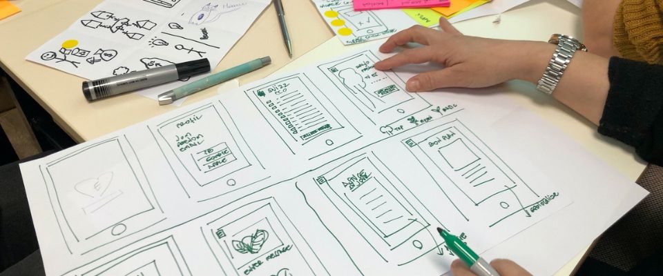
Creating an application that looks good is important, and ensuring that all of your buttons and icons are clearly labeled can help create a better user experience.
It’s the little touches, such as having an easily identifiable home button or search icon, which creates an intuitive, professional product for your users.
Labeling all of your buttons and icons clearly can make a huge difference in providing clarity to the functionality of your app and providing your users with a great overall experience.
Effective labeling means the user does not have to guess what each button does, thus making the experience smoother and more enjoyable. In addition, it makes troubleshooting much easier – users can quickly identify which element corresponds to a certain feature, or any potential errors that may arise.
It’s also important from an accessibility perspective; poorly labeled elements make it harder for users with disabilities to navigate around your app. To create an effective product, be sure to take note of this advice and make sure all of your buttons and icons are clearly labeled.
Final Thoughts on How to Create an App that Looks Good
By following the tips above, you can create an app that not only functions well but looks good too. As you can see, a lot goes into creating the perfect app.
Successful apps are a marriage of technology, artistry, branding, and marketing.
First, you have to understand what your ideal user looks like. Before you start making anything, market research is critical. This will tell you what your users are partial to and what pain points they have. The data you gather should guide every choice you make!
If you want to learn more about conducting preliminary market research for your app, take a look at our blog post on the topic!
Also, always keep this in mind: Users will be more likely to use and recommend an app that is pleasing to the eye and easy to navigate.
Keep these principles in mind as you design your next app!
What do you think? Comment below.
Since 2009, we have helped create 350+ next-generation apps for startups, Fortune 500s, growing businesses, and non-profits from around the globe. Think Partner, Not Agency.
Find us on social at #MakeItApp’n®


